Prevalence plot
a03_prevalence_plot.RmdIntroduction
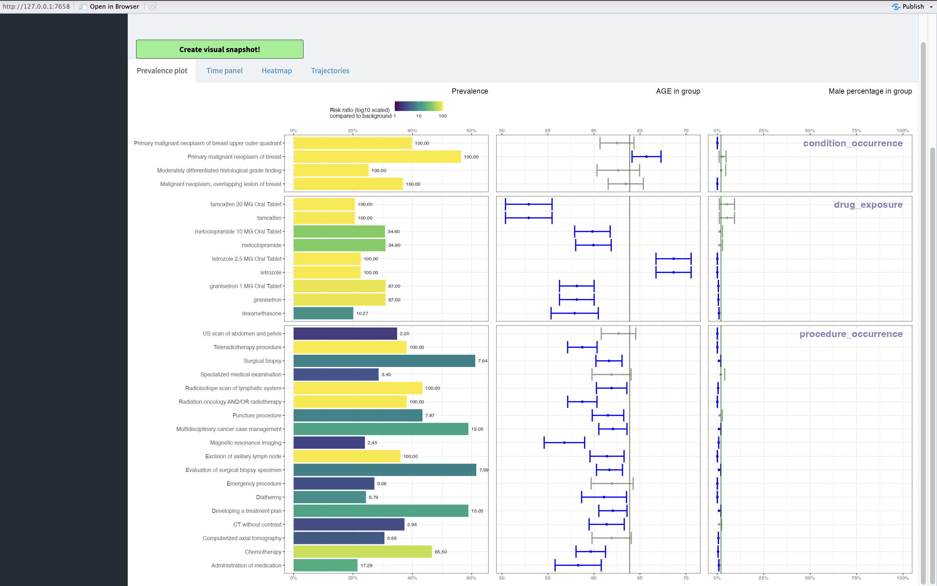
After selecting a study from the study table the first plot that you’ll see when using CohortContrast’s dashboard is the Prevalence plot. The prevalence plot is intended to show you the enrichment (over-representation/risk ratio) of different concepts inside the target cohort (vs control cohort). It also encapsulates the data about prevalence, age as well as gender. The prevalence plot consists of multiple parts.
Prevalence plot
Prevalence
The first plot called “Prevalence” has multiple dimensions of data.
Firstly you’ll see on y-axis the concepts that have threshold of atleast
defined in Risk Ratio cutoff and
Prevalence cutoff.
The threshold of Risk Ratio cutoff means that the
concept was present for the multiple of the defined value number of
patients
This is given as the fill (log-scaled) as well as text for the bars.
NOTE! If the concept was not present in control the default value is
100.00.
The threshold of Prevalence cutoff means that the
concept is present for atleast the given proprtion for people inside the
target cohort
This is given as the length of the bars as well as on the x-axis.
Age in group
The second plot called “Age in group” is describing the age of the patients who had the given concept present in data. The green vertical line stands for the average age inside the target cohort and the “whiskers” stand for the 95% confidence interval of the concept. The color blue of whiskers indicates that the given concept has on average different mean age than the target cohort itself. This can pinpoint some drugs which are prescribed to younger/older people or procedures.
Male percentage in group
The third plot called “Male percentage in group” is showing the gender distribution over the concepts. The green vertical line stands for the male percentage inside the target cohort and the “whiskers” stand for the 95% confidence interval of the concept. The color blue of whiskers indicates that the male percentage differs from the target populaton’s for the concept. This can pinpoint differences among gender and concepts of different medical interventions. In this example the percentage of men is very low, because the target group consists of breast cancer patients.