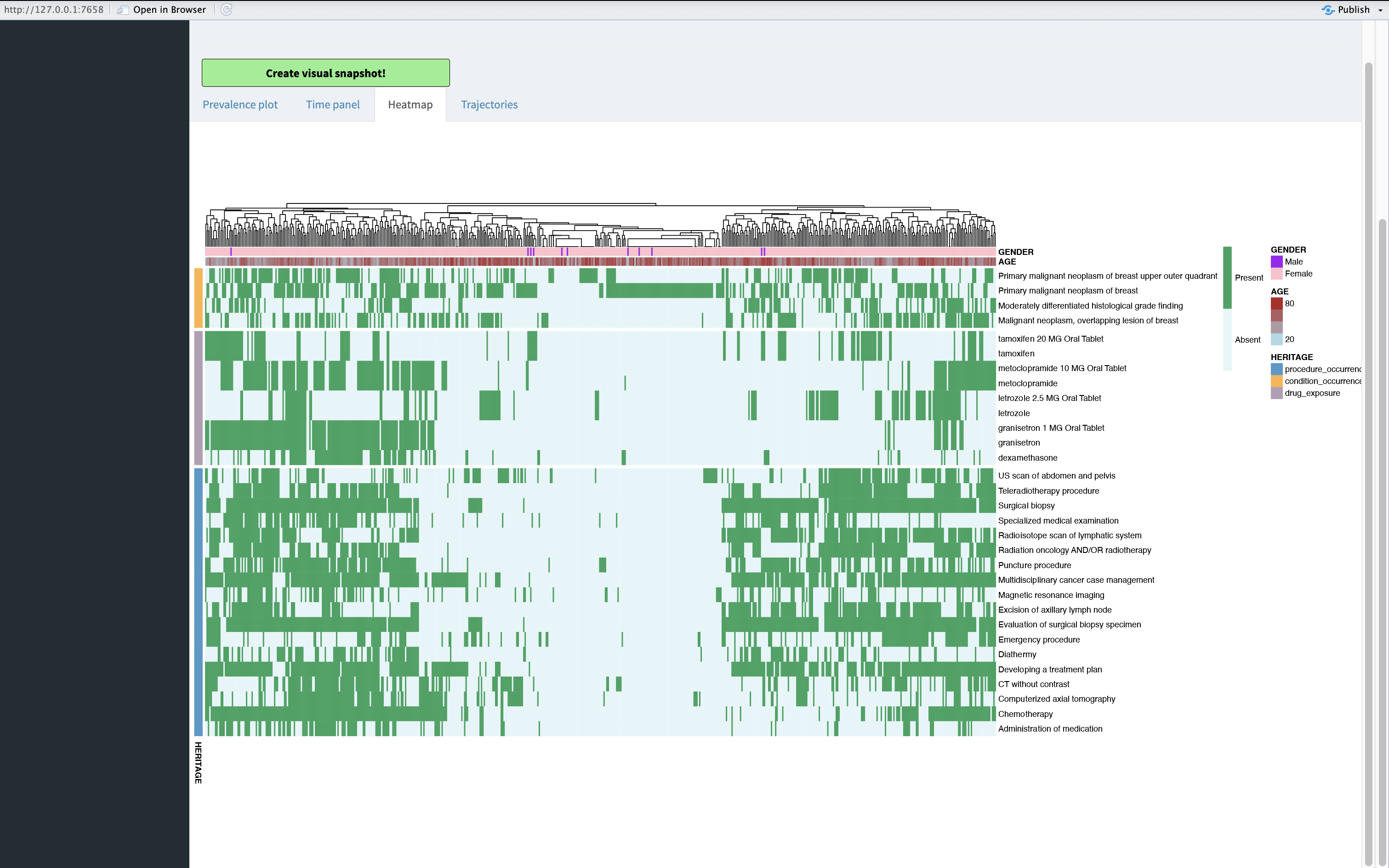
Heatmap plot
a05_heatmap_plot.RmdIntroduction
When relocating to the Heatmap plot you can see the same concepts as on Prevalence plot and Time panel but in a different manner. Heatmap plots are meant to show relationships between data points, the main idea is clustering. In here you can see patient level heatmap where the concept (rows) is green for a patient (columns) if they had at least one occurrence of that concept during the target cohort observation period.
Heatmap plot
Interpretation
The concepts are grouped by the domain as in the Prevalence plot and Time panel.
The heatmap has multiple layers of data. Firstly, on y axis we have the concepts. On x axis we have the patients clustered together according to the concept occurrence similarities. At the same time we can see on the x axis the gender and age distribution among the patients.
From the heatmap plot we can see that:
Most of the drug and drugs’ ingredients overlap.
Most of the people getting the diagnosis are treated to some extent, but approximately 20% of patients are left untreated (have only the condition)!
We might want to only observe people who have had some specific concept occurrence. For example it can make sense to filter for “Developing a treatment plan” as this can indicate people starting their treatment trajectory.
For this Filtering tab can be used. In there concepts can be removed or patients can be filtered by having or not having a given concept present. The filters themselves can be removed by just one click!
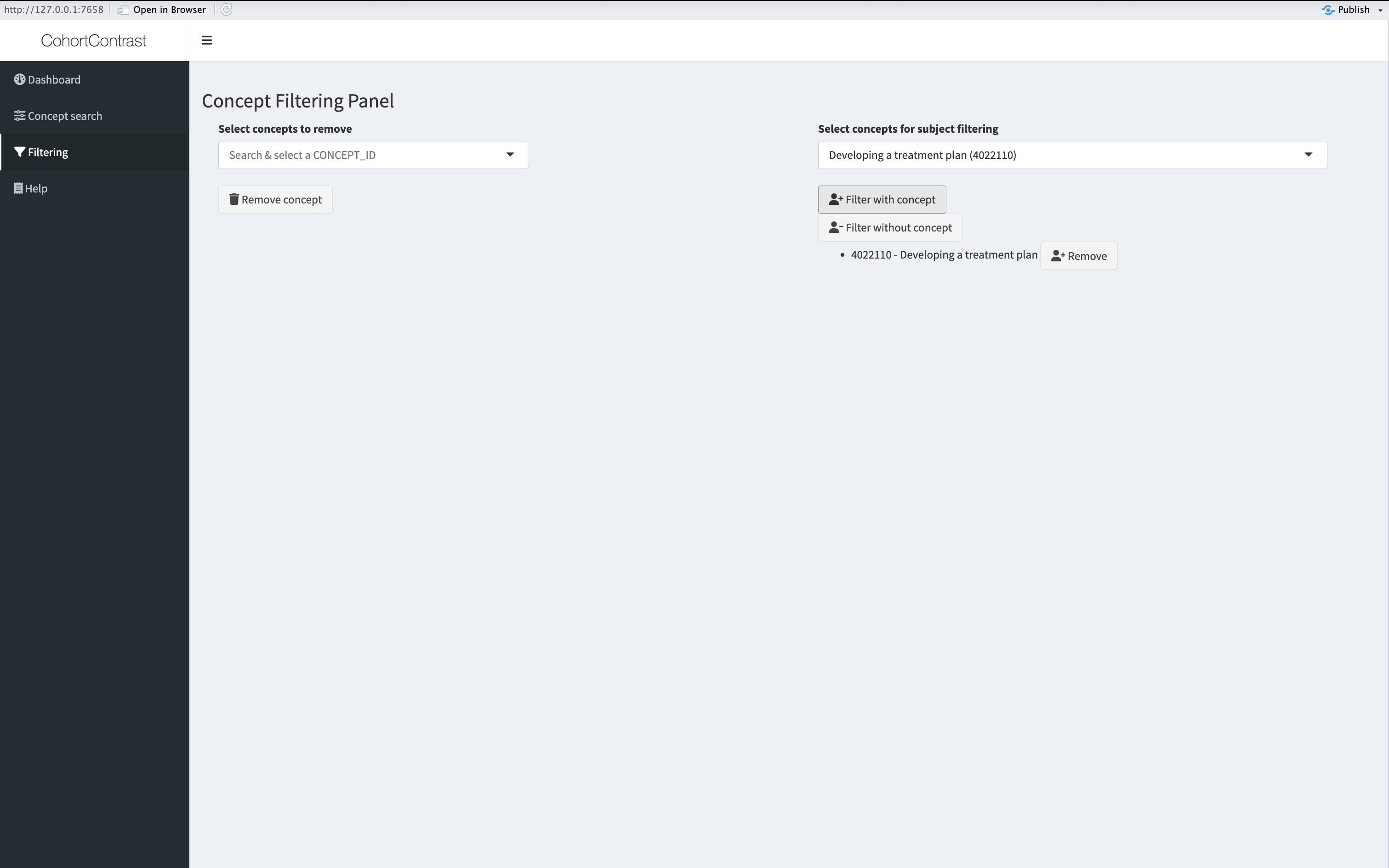 Here we
have filtered for all the patients with concept “Developing a treatment
plan”. After that we will get an updated heatmap plot in which there are
only patients who have had the treatment plan developing concept during
their observation period. The underlying data will be updated for all
the plots.
Here we
have filtered for all the patients with concept “Developing a treatment
plan”. After that we will get an updated heatmap plot in which there are
only patients who have had the treatment plan developing concept during
their observation period. The underlying data will be updated for all
the plots.
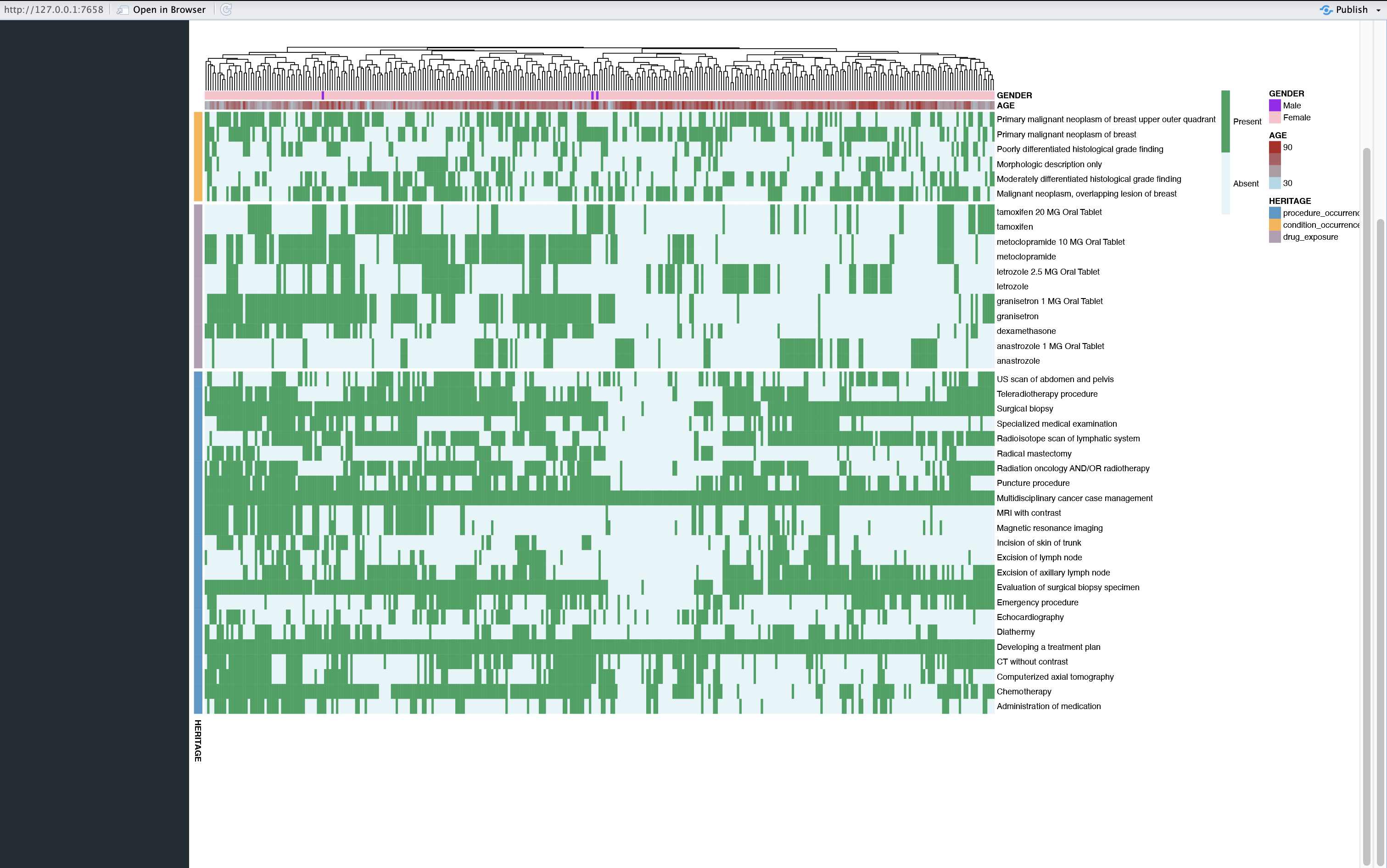
Updated heatmap