Introduction
The Dashboard is the primary analysis surface in CohortContrast. It combines effect size, prevalence, timing, and demographics for active concepts in one plot and one table.
The example below shows the kind of concept-level summary that feeds
the Dashboard table. Here we sort the bundled lc500 study
by target prevalence to inspect the most common concepts.
if (requireNamespace("nanoparquet", quietly = TRUE)) {
  studyDir <- system.file("example", "st", package = "CohortContrast")
  study <- CohortContrast::loadCohortContrastStudy("lc500", pathToResults = studyDir)

  # Order concepts by target prevalence to mimic a common Dashboard review step.
  dashboardPreview <- study$data_features[
    order(study$data_features$TARGET_SUBJECT_PREVALENCE, decreasing = TRUE),
    c("CONCEPT_ID", "CONCEPT_NAME", "HERITAGE", "TARGET_SUBJECT_PREVALENCE")
  ]

  utils::head(dashboardPreview, 5)
}
#>    CONCEPT_ID               CONCEPT_NAME             HERITAGE
#> 1      443388    Malignant tumor of lung condition_occurrence
#> 7     4032404               Bronchoscopy procedure_occurrence
#> 11    4167262      Needle biopsy of lung procedure_occurrence
#> 16       9202           Outpatient Visit         visit_detail
#> 4     4182985 Diffusion capacity of lung          measurement
#>    TARGET_SUBJECT_PREVALENCE
#> 1                      0.966
#> 7                      0.924
#> 11                     0.910
#> 16                     0.910
#> 4                      0.742
In the app, the same information is combined with timing, demographics, and clustering summaries in one interactive view.
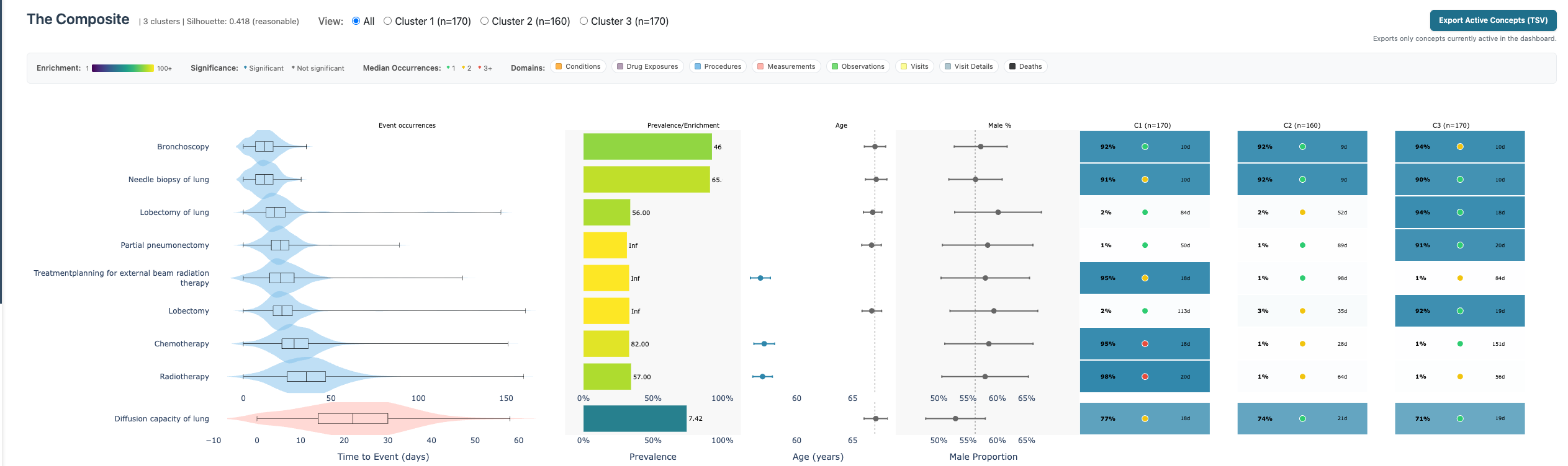
Dashboard composite plot
What the composite shows
The chart is concept-centric (one row per concept) and combines:
- Event occurrences: distribution of first occurrence timing.
- Prevalence/Enrichment: target prevalence and prevalence difference ratio.
- Age: concept-level age estimate relative to cohort context.
- Male proportion: concept-level sex distribution.
- Cluster columns: per-cluster prevalence summaries for the active clustering.
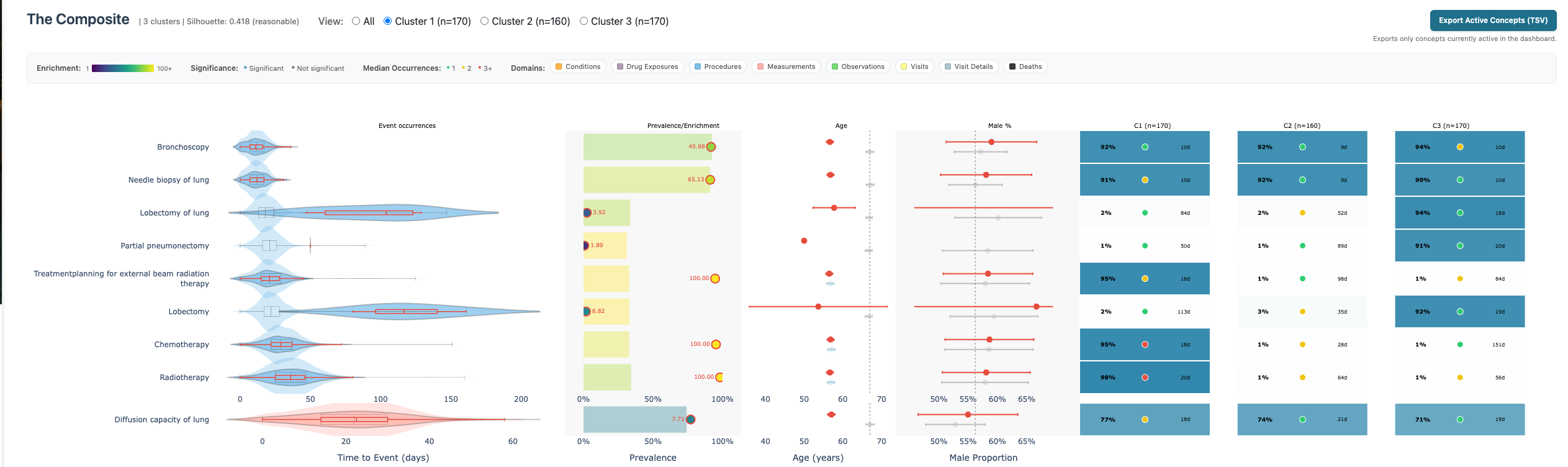
How to use it
- Apply sidebar filters and inspect which concepts remain active.
- Switch cluster view (
All,Cluster 1,Cluster 2, …) to compare within-cluster behavior. - Use table filters and the Show column for manual inclusion/exclusion.
- Click Apply Table Selection to persist manual visibility updates.
 5. Enable ordinal rows for concept’s
where on average >2 occurrences happen.
5. Enable ordinal rows for concept’s
where on average >2 occurrences happen. 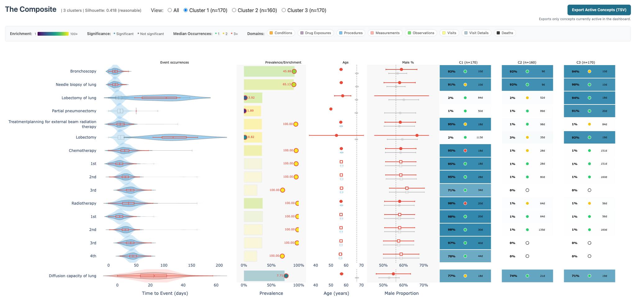
Interpretation guidance
- High prevalence difference ratio with solid target prevalence often indicates robust cohort contrast.
- Cluster-specific prevalence columns help distinguish global signals from cluster-local signals.
- Age/sex columns can expose clinically meaningful subgroup effects and potential confounding patterns.